Haiku and the Creation of Object-based Poems:
An Interview with Artist Rebecca Lowry
CR: Thank you very much for agreeing to this interview. Most of the questions will focus on your haiku-related projects, but I want to start with a question about your overall approach to your work in order to establish a context for the pieces involving haiku.
In your artist’s statement, you describe your works as “object-based poems.” You explain that “As a poet writes with words, utilizing their sense, sounds and the structure linking them, I write with objects and texts, employing their various qualities and the relationships between them.” The concept of poetry is clearly central to your work; however, many of the formal qualities of poetry are characteristic of other literary forms—essays, novels, plays, etc. These forms also allow ideas to be considered, meanings to be suggested and/or altered, and understandings to be developed. In what ways is poetry, specifically, a constitutive element of your work?
RL: Poetry has a distinctively different quality than these other forms of writing: it is a form that is carefully composed in a way that utilizes every quality of language and written text. It is the most intense form of written expression. Poetry is intended to be read and reread, to be carefully considered in all of its aspects. The study of a poem rewards with deeper or many layered understanding. I describe my work as a form of object based poetry in the sense that, like a poet considers every aspect of the language he uses—including fine points such as the sounds of the words as they interact with one another; the secondary readings of primary sense through management of format such as line endings, spacing etc.; obsession with word selection and manipulation of grammar, I consider every aspect of how the constituent parts of my pieces come together. It is a very rigorous approach. No decision goes unconsidered and every aspect of the work is intended to reinforce or multiply interpretation. Furthermore, as a very studied form, while poetry often gives something to the reader upon a quick perusal, it truly rewards careful, thoughtful re-reading. My work is built up with a similar intent to that of the poet and, while generous to a viewer looking for a purely aesthetic experience, hopefully provides similar rewards upon more thoughtful consideration.
Much of this way of looking at poetry I would say stems from undergraduate study I did under a professor named Christopher Ricks who is well known for his exquisitely detailed study of poetry. For those interested in close study, I’d recommend his book, The Force of Poetry.
I would say that the fact that poetry is a component of the work—in the sense that I will use a poem as a constituent element of a piece, much as I would use wool or graphite—is far less important. While some of the work incorporates poems, much of it does not. Having an actual poem in a piece, while important to that specific piece, is not essential to my practice. That said, it is wonderful to work directly with poetry... it provides for a different kind of dialog within a piece than does working with an otherwise loaded type of medium.
CR: What is your background in haiku? When did you first start reading haiku? Do you write haiku yourself?
RL: Honestly, I wouldn’t say I have any sort of specific back ground in haiku—other than familiarity from the general study of poetry... although I did fall for a guy once who was reciting his own humorous haiku at a poetry reading in a gritty part of London—that lasted about three years!
Overall, I’d say I came to look more closely at haiku as a result of a few of the first pieces I made: I was beginning to explore the relationship between meaning and its formal or physical expression and haiku was an appropriate source of meaning to work with as it is a very short and very rich poetic form. I was drawn to the fact that haiku usually describe—in a highly evocative way—a single moment in time that often has larger ideas or meanings buried within it. The history of the poems, too, is often important, such as using Basho’s frog pond poem for my first barcode piece: the richness of that poem’s history (and indeed, Ginsberg’s significant translation) is very important as all that is in the poem is then reduced to a formal expression unreadable by a human, who can appreciate everything that is buried in those symbols. Of course to a computer, the writing is highly legible, but to the computer, it is nothing more than a string of letters... the tension there is what makes the piece.
I’d answer your second question in saying that I didn’t begin actively reading haiku until I began searching for useful texts for my work—though the search for appropriate poems is always a delightful endeavor. The only haiku I’ve ever written was the one I recited at the recent haiku society meeting in Pasadena. I was told everyone would recite a poem and so thought I’d give it a try. For my work, it’s really more valuable to use haiku from a different time altogether or one that has other associations not my own attached to it. Though I did quite enjoy writing that one, so I may try my hand at others for the pleasure of it.
with a clatter, the sea
reshuffles
the stoney beach
CR: You may not, as you say, have a specific background in haiku or write haiku regularly, but your own haiku and your use of literary haiku in your object-based poems demonstrate careful attention to this poetic form.
In your previous response, you mention Poem, your c-print of Allen Ginsberg’s translation of Basho’s “old pond” haiku. I’d like to follow up on that, but first I want to ask one more general question about your use of haiku. You incorporate a variety of texts in your pieces, including those by Marcus Aurelius, Li Po, and Walt Whitman.
Although some longer texts are used in full (the New Testament and the 1963 Nuclear Test Ban Treaty, for example), many of your works include only fragments of other texts. Haiku, however, are consistently included in their entirety. Is that because of the brevity of the form, the fragmentary nature of haiku, the specific content of the individual haiku you use, or some other reason?
RL: I’d say it’s mostly due to the brevity of the form—but honestly, it’s not something I’d really considered... Thinking about it now, to take just a part of an already greatly condensed thing could be pretty powerful in the right context. Usually I prefer to use an entire text and only incorporate fragments if the piece itself is intended to represent a fragment of a greater whole: for example if a map is merely representing a fragment of a landmass, I will often use only a fragment of a text as though both run off the edges to some unspecified point...
CR: Let’s return to your project from 2003, Poem, involving Ginsberg’s translation of Basho’s haiku:
Th’ old pond—a frog jumps in. Kerplunk!
Given that Basho’s poem is probably the most widely translated haiku in the world, what informed your decision to use Ginsberg’s translation?
RL: For this piece I was looking for a poem with tremendous richness in association... the frog pond poem was desirable because it has been translated so many times in so many ways over the years —and using Ginsberg’s translation brought in the whole Beat movement and all that is associated with it... Ginsberg introduced a whole new way of expressing Basho’s initial experience but also a new way of considering poetry as a whole and, indeed, a new approach to life. So the very dry, mechanical expression of the poem in the piece is conflated with great complexity and associational depth.
CR: In 2003 you also created thirty haiku text messages. What led you to use haiku for these messages? What were your criteria for choosing the haiku?
RL: The text/message piece came about when I was living in Switzerland. It was still early days for text messaging— hardly anybody was communicating this way in the U.S.—but it was a heavily used new technology in Europe. In Switzerland it is referred to as SMS. I had simply noticed that the messages everyone was sending one another were very prosaic: “I’m going to be 5 minutes late” or “meet us at the Frauenbadi.” It seemed to me that it would be delightful for a person to receive something other than that via text message, so I thought to send people haiku poems. It seemed a perfect fit as a haiku is basically a sharing of a very specific experience and the format perfectly suited the brief text allowed by early text messaging phones... it was that simple. The relics of the piece are the framed photos of the messages just before they were sent out, but really, the meat of the piece was the actual sending of the messages...
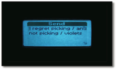
sent to annegret h.: I regret, anonymous (c. 1640-1700)
Text/Message, 2003, c-print on metallic paper, acrylic mount, 3” x 5”
My criteria for selecting the haiku were merely to find a specific poem to share with the individual it was being sent to. They were all friends and acquaintances of mine. I made sure that none of the poems required specific knowledge of Japan as that would render them less accessible to the recipients. Really a very simple project—a precursor though to REGARD. and the Home Depot business card project, Poem Depot.
CR: Since these initial projects, much of your work has involved haiku, including pieces in which haiku are embroidered in Braille on different maps. For instance, in Winter Has Begun, from 2008, you used silk to embroider the following haiku onto an American military map of the Middle East:
winter has begun—
trees alive and dead
indistinguishable
Would you elaborate on the use of Braille, the relationship between the haiku and the military map, and the decision to use silk to em- broider the haiku?
RL: In my work, the use of Braille is similar to the use of barcodes: it is a way of rendering meaning less accessible or accessible in a different way. Braille was interesting to me for use on a map as dots on a map generally identify specific places—they are a means of communicating. So to use a dot-based writing system on maps seemed to me an interesting confluence. The red silk knots allude to the textile traditions of the Middle East, such as rug-making. This suggests consideration of the map as something hung vertically that represents a horizontal condition (the ground, a rug)... then of course, spots of red can allude to drops of blood as well, casting the poem in a different light. Also, the entire map was crumpled up into a ball (as though it were trash to be tossed) and then was uncrumpled, the resulting texture reading as topographic relief...
CR: You have also embroidered haiku in Braille onto fabric. Would you discuss the differences between the “map haiku” projects and the “fabric haiku” projects? How does each contribute to the trajectory of your work?
RL: The map and fabric pieces are actually quite different. Whereas the maps relate strongly to ideas of place and scale, the fabric pieces focus more on Braille as a writing system that is read by hand. The fabrics hang loosely and so move away from your fingers, preventing you from ever exerting much pressure on them. Paper on a table pushes back, fabric doesn’t. Also fabrics are chosen as much by how they feel—and their associations with touch—as how they look. These are all considerations in composing the fabric pieces.
As to your second question, I don’t really see my work as having a single trajectory. I’d say my practice functions less like a river—a single stream with a few tangents—and more like a delta—a slow, concurrent progression of many related lines of inquiry. For some lines, I’ll complete fewer than one piece per year.... The result of this is that work on one idea often informs or transforms my thinking on another.... As things progress, one can often find connections through different bodies of work.
CR: I’d like to ask some more questions about your use of bar-codes. Specifically, I’m interested in the Shogai series you created in 2009 which was part of an exhibit that opened in January 2010. The series is comprised of five barcodes inked on paper, and the haiku within each barcode is a different Japanese death haiku.
When Paige Wery interviewed you for Artillery, you described one of the intriguing aspects of the barcode/death haiku pieces as the recognition that “There’s content in these patterns that we can’t get at. We know it’s there and we can’t see it.” What is the significance of using death haiku, as opposed to other haiku, for the information that is simultaneously present and inaccessible?
RL: I would say that that tension exists in all of the bar-code work—indeed, it is a component of much of my work overall. The Shogai series is simply an iteration. That said, the fact that these words are produced as the poet is transitioning from being to non-being certainly brings this idea to the fore. Much of what I do explores the idea of that ineffable spark—be it the true substance of what is conveyed to us through text or that indefinable something that makes you more than a body and that, at the end, simply disappears. I suppose you could reduce it to: text is to the body as meaning is to the a soul—in a sense.
CR: To what extent does the design of each piece—placement of the barcode on the paper, ink patterns, etc.—resonate with the actual content of the haiku?
RL: In these pieces there is a direct relationship. So that upon consideration of the poem, the barcode on the field of paper becomes not just a text, but also an image. The bars become a forest edge, or a stand of grass, or a path in the snow. For instance Mizu describes water and so the barcode is turned horizontally as though the sun is reflecting on the surface of the water... This is a bit of a change from my usual practice as I usually veer away from direct representation, but in these pieces, I think it adds substantially to the work.
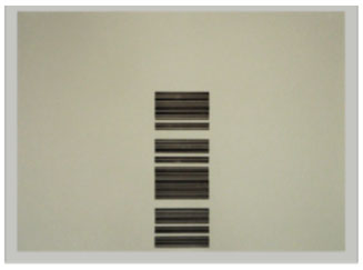
Mizu (from the series Shogai), 2009, ink on paper, 19” x 22”
CR: The haiku in the barcodes are Japanese haiku, so while it’s true that there is “content in these patterns that we can’t get at,” even if one could access that content, one would need to know Japanese to understand it. What informed your decision to use the original Japanese versions of the haiku instead of translations? How does this additional level of potential obstruction fit into the project?
RL: I really prefer to use texts in as original a form as possible as translation always brings so many additional issues along with it. Of course, for some pieces, that just won’t work. For the Shogai series, I simply wanted the words to be the true words of the poets. Translations are provided on labels so that viewers can understand the work better, but the translations could be in German or Spanish or Greek—the words on the page remain in their original form. I often rely on labels to give the viewer some idea of what they’re looking at. That way they can see the contents of the work in their mind’s eye—which is really it’s true form.
CR: Languages and translation come up in another of your haiku-related projects, REGARD.. You designed eleven municipal signs that, excepting the color and text, are exact replicas of a standard parking sign. Each sign features an individual haiku, and some of the signs are in English, some in Spanish, and some in Russian. The City of West Hollywood funded and installed the signs.
How did you get the idea for this project? What is the significance of the title, and what impact do you hope the signs will have?
RL: This project came about in conjunction with a show put on by Artlab 21 and the LA Art Association. The curator of the show, Bernhard Zuenkeler, requested that each of the four artists participating in the show make work for the gallery and also something that would be out in the city. The show was intended to explore ideas of communication and the city, so I began to think about how the city communicates with its citizens. The most common form of this communication is signage, which generally tells you where things are or what to do or, more commonly, what not to do. I saw this as an opportunity for a different kind of government to citizen communication....
As to the title, REGARD., it is a play on the standard government sign in that it tells you what to do. Though I imagine this is usually done for legibility, it usually gives the impression that you disobey the command at your own peril... which of course, is often the case!
I hope that the project will be a source of enjoyment for the people who encounter it—a gift from the city to its people rather than a command. I imagine there will be some rather confused citizens, at first anyway. A bit of confusion can be good, though—it stops people and makes them think, trying to figure out the puzzle. I see these poem signs as a shared thought across time, a shared moment or experience. I hope to stop people in the course of their days and give them something to ponder, to take with them as they carry on. Something to discuss when they get home, or back to the office... or maybe just something shared to keep inside themselves.
CR: How did you select the specific haiku used for the signs?
RL: How these signs are read is very important. On parking signs, there is usually text in a larger and or contrasting font that can be read easily from a distance, giving you the main gist of the message “NO PARKING” or “2 HOUR” and then as you get closer, the fine print fills you in on the details. So I looked for poems that had a similar capacity: poems that, with certain words highlighted, are read one way, and that then could be comprehended in their entirety closer up. So for instance, the poem “When autumn winds blow, not one leaf remains the way it was” when reformatted, reads “NOT 1 WAY” from a distance. Some of the poems have initial distance readings that seem like they could pertain to traffic situations such as “BEFORE BEHIND BEFORE” and “TODAY HOUR,” there’s one sign that didn’t get installed but that I quite like: from a distance it reads “DESCANSAN MUERTAS” or “FALL DEAD”—that’s a sign you want to pay attention to! The actual poem reads “Bajo las aguas descansan en la roca las hojas muertas”[*] or loosely translated “Beneath the water, the dead leaves fall to the rocks.” Of course, I was also looking for poems that had travelled through time, tying the present moment to the past, and that did not refer to anything so specifically Japanese that an average American couldn’t relate to it. Most Americans haven’t seen Mt. Fuji or appreciate the significance of cherry blossoms...
*Editors’ Note: No information was given for this poem, but it is likely a Spanish version of a haiku by Naito Joso, 1662–1704.
CR: Why did you decide to use haiku in these three different languages?
RL: My initial thought had been to make signs in English and Spanish to include LA’s majority population groups—this was before the city of West Hollywood came on board. The project was initially one I was going to execute myself throughout greater Los Angeles. Currently there is only one Spanish sign installed. I would have liked to include more but as it is I consider myself lucky to have gotten as many signs up as there are.... When WEHO adopted the project, they requested that I include some Russian signs as they have a significant immigrant Russian population that they wanted to include. It was quite a challenge as I had to invent a municipal Cyrillic font and finding Russian translations of haiku and understanding them was not an easy task. Fortunately I had a few consultants to help me out.
CR: Did you select the sites or did the city? What were the criteria for choosing the sites?
RL: I selected the sites, then they had to be approved by the city’s transportation department. The schedule for the project was an incredible one as I first met with the city in late October and the project had to be approved, funded, sites ap- proved and the whole thing installed by January and that with two weeks down for the holidays. It was crazy. I chose a first round of sites and they were nearly all rejected—the project nearly died at that point—then I went back and chose a whole new round of sites based on different criteria and fortunately, eleven of those were approved.
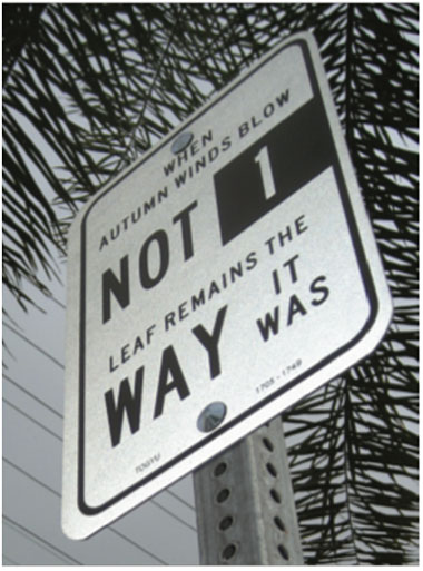
When autumn winds blow, not one leaf remains the way it was
Togyu (1705-1749)
REGARD., 2010, retroflective film, ink on aluminum, 12” x 18”
In choosing sites, I wanted a wide variety—some in very prominent, busy places and others back in quiet neighbor- hoods. There’s a sign on the sunset strip and another in front of the local high school. All of the signs needed to be located in places where it would be in some way logical to find a parking sign, but I was not allowed to place them in any permit parking zones or other areas where there were official parking signs in force... so that was certainly a challenge. I placed a few on streets where traffic backs up at lights, giving motorists an opportunity to see the signs and giving them something to think about at the light. Many of the signs are in places where pedestrians are just as likely to encounter them as drivers. One is in front of a local newsstand...
CR: I’d like to return to the topic of translation. You’ve mentioned that you “prefer to use texts in as original a form as possible as translation always brings so many additional issues along with it,” but you were speaking specifically about linguistic translation and choosing to use haiku in the original Japanese. The larger issues raised by translation, especially given a definition of “to translate” as “to change,” actually seem important to your work. Many of your projects involve translation on several levels including not only changing the language of a text, but also changing the medium used to convey information. Some pieces create a target text that is more accessible to people than the original source text because of the change in language. Other pieces make the original information completely inaccessible. Both instances draw attention to the acts of conveying and comprehending information. Would you elaborate on the ways in which the concept of translation does or does not figure in your philosophy and goals as an artist?
RL: Yes, that’s it exactly. My work is definitely about translation in the sense you describe. I think what I was getting at before is that every translatory step has significance in the final reading and I am reluctant to incorporate a step into a piece that does not have reference specifically to what I am trying to achieve with that piece. For instance, for Poem of 2003, I specifically used Ginsberg’s translation as it adds a very particular layer of depth to the piece—it’s as much a relevant change from the original as my use of the barcode. Once I engage another person’s translation of a poem simply for legibility, it muddies those waters. Sometimes linguistic translation is necessary for the piece to make sense to the audience of the work, and specifically relevant translations don’t exist, so while the translation plays a role, it is a minor one—as with the REGARD. project. In these cases I simply do my best to be as accurate to the poem and as respectful to both the poet and translator as possible. Right now I’m producing a new body of work that uses music as its content instead of poetry and the issues are startlingly similar—to what extent must I adhere to the conventions of musical notation for the work to be comprehensible and to what degree can or should I move away from the original score, perhaps losing some of the original intent but gaining in some other aspect? There’s no clear answer, but plenty of opportunity for exploration. The tension between desire to know, to see, and the satisfaction but finality of knowing/seeing is the seam I mine.
Bagatelle no. 25 in A minor, 2010, ink on paper, 30” x 40”
CR: Let’s conclude with a few questions about current and future haiku-related projects. Poem Depot involves the distribution of haiku business cards at a Home Depot store where you leave the cards on vehicles in the parking lot. How did you get the idea for Poem Depot? How many different cards are there at present? Is the distribution random or is there significance to the relationship between the card, the haiku, and the vehicle? Do you have plans to expand this project?
RL: Poem Depot is the next in the series of works that began with the text messages I was sending in Switzerland and of which REGARD. is a part as well. I think I’ll call it the Conveyance series. These works all involve conveying meaning through an unusual delivery method and thereby calling into question the mode of communication and seeing the content
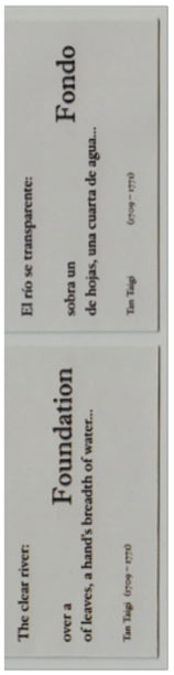
Poem Depot, 2010 ongoing, ink on plastic coated paper, 2" x 3.5"
Foundation/Fondo Tan Taigi (1709-1771), translation Vincent Haya
in a new light. Poem Depot is really a gift to the people who frequent my local Home Depot. It’s not a project that has any greater goals than to intrigue and, hopefully, delight a population of people who usually have little or no exposure to conceptual art. The idea came about as I was recently renovating a house and so spending huge amounts of time at the Cypress Park Home Depot. I noticed that many small contractors and other businesses would advertise their services by leaving business cards on cars in the parking lot. What a great opportunity!
There are four different cards. Each has a haiku written on it in English on one side and Spanish on the other. The distribution is completely random—just whichever vehicles I can slip cards onto without being noticed by security. I do especially like to target work trucks and run down cars that are often used by day laborers. I’m quite gratified to say I have never found one of my cards lying in the parking lot. No one is discarding them, which tells me I must be affecting people in some way. I don’t currently have plans to expand this project, though it will be ongoing for quite some time. If I were to go to another Home Depot and observe people using the same advertising strategy, I’d probably sprinkle some cards around there too... It really only makes sense if there’s already such communication already established at a given location...
CR: Do you have any other current projects involving haiku or ideas for future haiku-related projects?
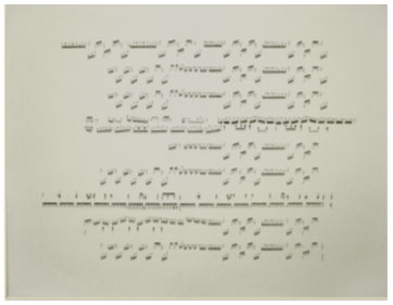
RL: I’m not focusing on any specifically haiku-related projects at the moment, but there will undoubtedly be more in the future. I’d like to continue with the Conveyance series, but I’ll have to wait til the next idea for that comes to me. I may expand Shogai to six pieces. My series tend to proceed quite sporadically as I get interested in other work and then come back to them. I periodically make little barcode drawings and may include some new ones for an upcoming show. I have talked with Michael Dylan Welch about collaborating on a project—hopefully that will happen at some point. I do truly enjoy working with haiku poetry and expect it will be a part of my practice for many years to come.
![]()